Editor’s Note: The Atlantic is making vital coverage of the coronavirus available to all readers. Find the collection here.
There is no mystery in the number of Americans dying from COVID-19.
Despite political leaders trivializing the pandemic, deaths are rising again: The seven-day average for deaths per day has now jumped by more than 200 since July 6, according to data compiled by the COVID Tracking Project at The Atlantic. By our count, states reported 855 deaths today, in line with the recent elevated numbers in mid-July.
The deaths are not happening in unpredictable places. Rather, people are dying at higher rates where there are lots of COVID-19 cases and hospitalizations: in Florida, Arizona, Texas, and California, as well as a host of smaller southern states that all rushed to open up.
The deaths are also not happening in an unpredictable amount of time after the new outbreaks emerged. Simply look at the curves yourself. Cases began to rise on June 16; a week later, hospitalizations began to rise. Two weeks after that—21 days after cases rose—states began to report more deaths. That’s the exact number of days that the Centers for Disease Control and Prevention has estimated from the onset of symptoms to the reporting of a death.
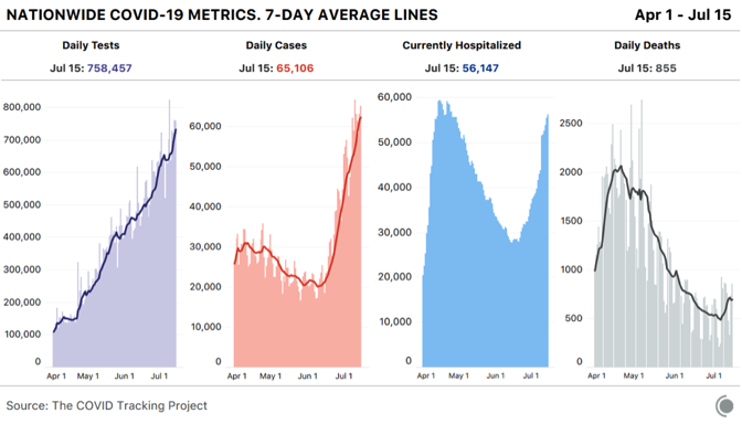
Many people who don’t want COVID-19 to be the terrible crisis that it is have clung to the idea that more cases won’t mean more deaths. Some Americans have been perplexed by a downward trend of national deaths, even as cases exploded in the Sun Belt region. But given the policy choices that state and federal officials have made, the virus has done exactly what public-health experts expected. When states reopened in late April and May with plenty of infected people within their borders, cases began to grow. COVID-19 is highly transmissible, makes a large subset of people who catch it seriously ill, and kills many more people than the flu or any other infectious disease circulating in the country.
The likelihood that more cases of COVID-19 would mean that more people would die from the disease has always been very high. Even at the low point for deaths in the U.S., roughly 500 people died each day, on average. Now, with the national death numbers rising once again, there’s simply no argument that America can sustain coronavirus outbreaks while somehow escaping fatalities. America’s deadly summer coronavirus surge is undeniable. And it was predictable this whole time by looking honestly at the data.
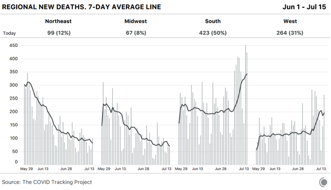
In the United States, the rising severity of the current moment was obscured for several weeks by the downward drift of cases, hospitalizations, and deaths resulting from the spring outbreak in northeastern states. Even though deaths have been rising in the hardest-hit states of the Sun Belt surge, falling deaths in the Northeast disguised the trend.
It is true that the proportion of infections in younger people increased in June and July compared with March and April. And young people have a much lower risk of dying than people in their 60s and older. But, at least in Florida, where the best age data are available, early evidence suggests that the virus is already spreading to older people. Additionally, analysis of CDC data by The New York Times has found that younger Black and Latino people have a much higher risk of dying from COVID-19 than white people the same age. According to the racial data compiled by the COVID Tracking Project in concert with the Boston University Center for Antiracist Research, Latinos in Arizona, California, Florida, and Texas are 1.3 to 1.6 times more likely to be infected than their proportion of the population would suggest. It is telling that despite outbreaks all over Texas in recent weeks, the border region has been leading the state in deaths per capita.
Even with cases surging, if hospitalizations were not rising, that might suggest that this outbreak might be less deadly than the spring’s. But hospitalization data maintained by the COVID Tracking Project suggested otherwise as early as June 23. On that date, hospitalizations began to tick up across the South and West, and they have not stopped. It’s possible we’ll match the national peak number of hospitalizations from the spring outbreak over the next week.
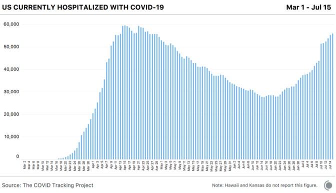
Even if better knowledge of the disease and new treatments have improved outcomes by 25 or even 50 percent, so many people are now in the hospital that some of them will almost certainly die.
There was always a logical, simple explanation for why cases and hospitalizations rose through the end of June while deaths did not: It takes a while for people to die of COVID-19 and for those deaths to be reported to authorities.
So why has there been so much confusion about the COVID-19 death toll? The second surge is inconvenient for the Trump administration and the Republican governors who followed its lead, as well as for Mike Pence, the head of the coronavirus task force, who declared victory in a spectacularly incorrect Wall Street Journal op-ed titled, “There Isn’t a Coronavirus ‘Second Wave.’”
“Cases have stabilized over the past two weeks, with the daily average case rate across the U.S. dropping to 20,000—down from 30,000 in April and 25,000 in May,” Pence wrote. In the month since Pence made this assertion, the seven-day average of cases has tripled. Several individual states have reported more than 10,000 cases in a day, and Florida alone reported 15,000 cases, more than any state had before, on an absolute or per capita basis.

But there’s another reason for some of the confusion about the severity of the outbreak right now. And that’s the perceived speed at which the outbreak initially landed on American shores and started killing people. The lack of testing let the virus run free in February and much of March. As my colleague Robinson Meyer and I put it at the time, “Without testing, there was only one way to know the severity of the outbreak: counting the dead.” And that is how we figured out how bad the outbreak was. Thousands began dying in the greater New York City area and a few other cities around the country in early April. The seven-day average for new cases peaked on April 10, followed by the peak of the seven-day average for daily deaths just 11 days later.
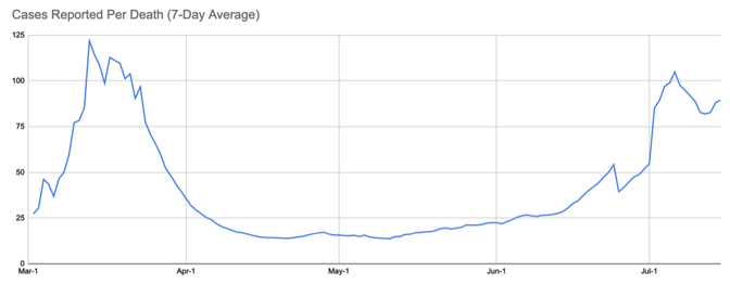
Everything seemed to happen at once: lots of cases, lots of hospitalizations, lots of deaths. But some of this is also the compression of memory. Most of us remember the deaths in March beginning as quickly as the cases, especially given the testing debacle. That’s not exactly what happened, however. The nation did, in fact, see cases rise weeks before the death toll shot up. There was a time in March when we had detected more than 100 cases for each death we recorded. This is a crucial metric because it gets at the perceived gap between cases and deaths. And it tells us that we did see a lag between rising cases and deaths back in the spring.
During the slow-decline phase in May, the case-to-deaths ratio fell to about 20. Then, this summer, the case-to-death ratio began to rise in early June. On July 6, the ratio hit 100 again, just like in the spring. But as in spring, this was not a good sign, but rather the leading indicator that a new round of outbreaks was taking hold in the country. And, indeed, a week ago, this ratio began to fall as deaths ramped up.
The U.S. came most of the way down the curve from the dark days of April, and now we’re watching the surge happen again. The testing delays, the emergency-room-nurse stories, the refrigerated morgue trucks—the first time as a tragedy, the second time as an even greater tragedy. One must ask, without really wanting to know the answer, How bad could this round get?
By the absolute or per capita numbers, the U.S. stands out as nearly the only country besides Iran that had a large spring outbreak, began to suppress the virus, and then simply let the virus come back.
No other country in the world has attempted what the U.S. appears to be stumbling into. Right now, many, many communities have huge numbers of infections. When other countries reached this kind of takeoff point for viral spread, they took drastic measures. Although a few states like California are rolling back reopening, most American states are adamant about opening into the teeth of the outbreak. And this level of outbreak will not stay neatly within a governor’s political boundaries. There’s no way to win this state by state, and yet that’s exactly what we’re attempting. From the look of the map, the South and West—regions with a combined 200 million people—are in trouble.
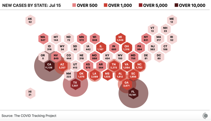
The regional variation of the American outbreak is crucial to understanding both what happened and what’s going to happen next. Nationwide, the U.S. deaths per million tally—a hair under 400—is in the top ten globally. But look just at the Northeast’s 56 million people, and the death rate is more than double the national average: 1,100 deaths per million.
By contrast, the South and West—where SARS-CoV-2 is burning through the population—are much more populous than the Northeast. If those areas continue to see cases grow, they could see as many deaths per million as the Northeast did but multiplied by a larger number of people. At 1,100 deaths per million, the South and West would see 180,000 more deaths. Even at half the Northeast’s number, that’s another 69,000 Americans.
In truth, the fan of possibilities is probably wider. Looking at individual states, there was tremendous variation from low-death states like New Hampshire (288 deaths per million), to extremely high-death states like New Jersey (1,750 deaths per million), and a bunch in between, like Massachusetts (1,208); Washington, D.C. (805); and Pennsylvania (539).
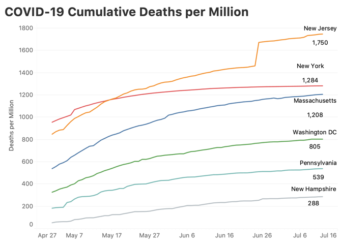
It’s possible that the summer-outbreak states could follow the lower death trajectory traced by Pennsylvania or Washington, D.C. Right now, only Arizona, at 307 deaths per million has crossed even the lowest line above, New Hampshire; there is a lot of room for things to get worse, even if they do not come close to equaling the horrors of the spring.
New York City is and probably will remain the worst-case scenario. New York City has lost 23,353 lives. That’s 0.28 percent of the city’s population. If, as some antibody-prevalence surveys suggest, 20 percent of New Yorkers were infected, that’s an infection-fatality rate of more than 1.3 percent, which exceeds what the CDC or anyone else is planning for. To put it in the same terms discussed here, New York City saw 2,780 deaths per million people. A similar scenario across the South and West would kill over 550,000 more Americans in just a few months, moving the country to 680,000 dead. It is unthinkable, and yet, 130,000 deaths—the current national death toll—was once unthinkable, too.
That’s still not the worst-case scenario for a truly uncontained outbreak, in which serious measures are not taken. For months, most public-health officials have argued that the infection-fatality rate—the number of people who die from all infections, detected and undetected, symptomatic and asymptomatic—was somewhere between 0.5 and 1 percent. The CDC’s latest estimates in its planning scenarios range from 0.5 to 0.8 percent. Take that lower number and imagine that roughly 40 percent of the country becomes infected. That’s 800,000 lives lost.
The point in laying out these scenarios is not that we’ll reach 300,000 or 800,000 American COVID-19 deaths. That still seems unlikely. But anyone who thinks we can just ride out the storm has perhaps not engaged with the reality of the problem. As the former CDC director Tom Frieden has said, “COVID is not going to stop on its own. The virus will continue to spread until we stop it.”
The lack of containment by American authorities has resulted in not only lost lives, but also lost businesses, savings accounts, school years, dreams, public trust, friendships. The country cannot get back to normal with a highly transmissible, deadly virus spreading in our communities. There will be no way to just “live with it.” There will only be dying from it for the unlucky, and barely surviving it for the rest of us.
Via: The Atlantic
For more coronavirus coverage, visit: www.ehealthweek.com/covid-19


